UI Views
Customized changes to the user interface configuration can be introduced through the use of UI View configuration documents. UI Views are JSON documents that contain one or more configuration blocks.
The UI View configuration blocks are loaded after the standard configuration document and therefore have the opportunity to either extend or override the base configuration.
UI View are scoped either to the platform or to the project. As such, you can use UI Config objects to customize the Platform UI independently from the Project UI.
A UI View configuration document contains configuration blocks that bind to the User Interface's configuration service when the browser loads. These configuration documents follow the convention detailed in the Configuration docs. We recommend reading through that to understand what the configuration service is and how it assembles a runtime config document to drive the UI at render time.
Adding a UI View to the Platform
If you are a Manager of the Platform, you have the ability to add Platform-level UI configuration.
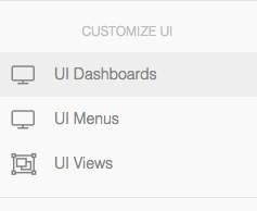
To begin, go to Manage Platform > UI Views -
Click on the Create UI View button to create a new UI View configuration.
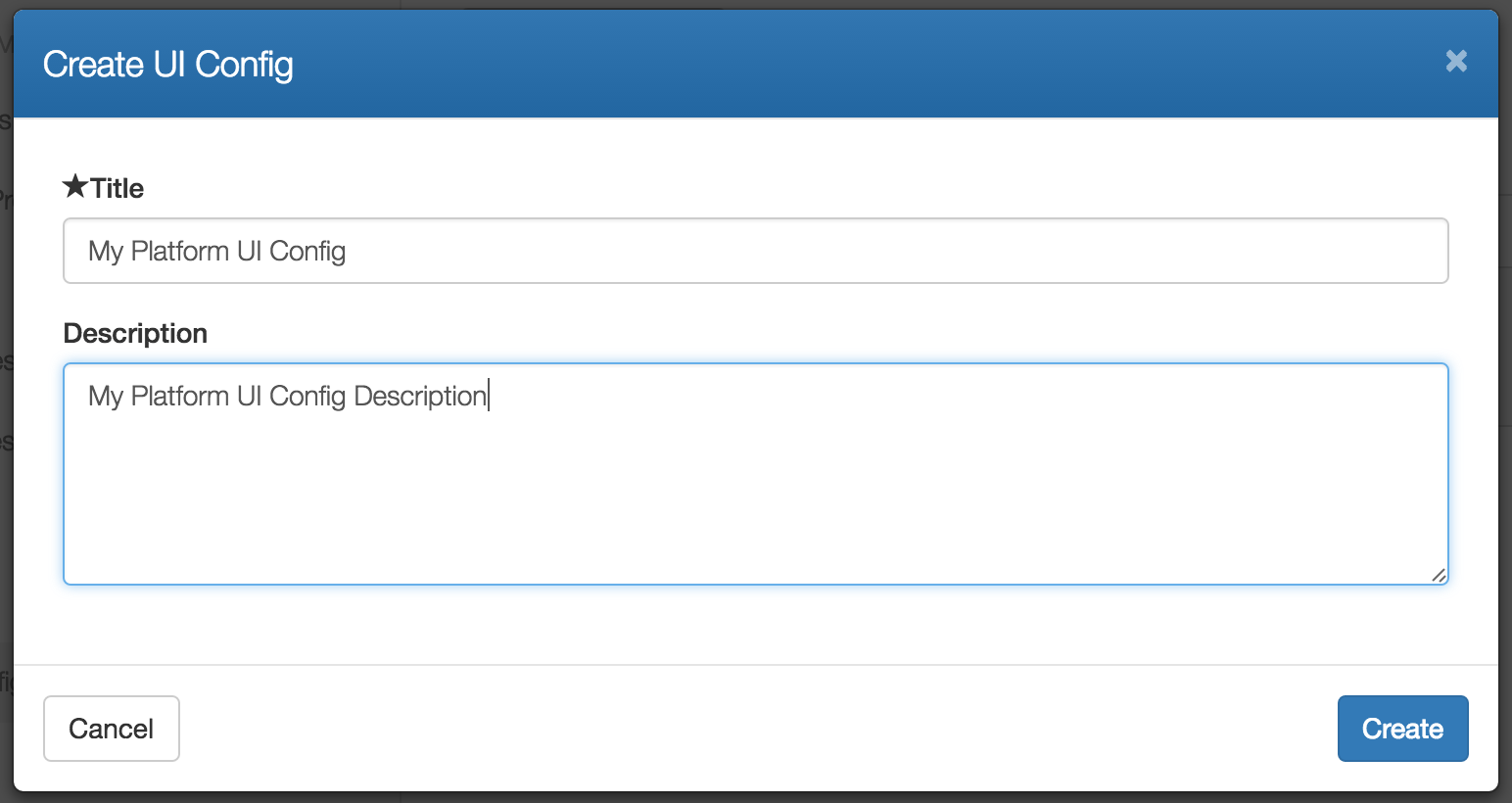
Give your UI View configuration a title and a optional description. These can be any value you like. The title will be visible to your end users when they select to use your view.
Click on Create to create the UI View. It will be empty by default. This means that it doesn't introduce any additional configuration and so it isn't doing anything at the moment.
Click on the title of your new UI View to begin editing it. You will see something like the following:
{
    "title": "My UI View",
    "description": "My UI View Description",
    "config": {
        "blocks": []
    },
    "enabled": true
}
The enabled property can be used to enable or disable your view. If the view is disabled, it won't be selectable by your end users. You can use this to retain old versions of views in case you have something you want to keep track of but no longer want to make available.
The config section is the interesting section. This is where the actual configuration is stored. Specifically, the blocks array contains a set of configuration blocks that the configuration service will evaluate to figure out what to show on the screen.
If you've read through the Configuration Service docs, then you'll be aware that each block consists of an evaluator, a condition and some additional config to be injected into the user interface should the block evaluate to true.
Each block sort of looks like this:
{
    "evaluator": "{evaluatorType}",
    "condition": "{condition}",
    "config": {
        ...
    }
}
When the Cloud CMS user interface renders, it will evaluate all of the blocks it knows about and will merge together a final configuration that is then used to render the page. It does on every page click and it does it blindingly fast. The result is a user interface is that is fully dynamic based on who is logged in, what they're looking and what kinds of permissions the user has over everything they're looking at.
Nothing is hardcoded and the UI can vary dramatically for different kinds of users depending on what sort of editorial experience you seek to provide.
The evaluatorType is the kind of evaluator to execute. Cloud CMS provides a library of evaluators that you can choose from. We recommend that you take a look at kinds of evaluators that are available.
Each evaluator makes a quick decision based on what it knows about the runtime state of the rendering app. It knows who the current user is, what they're looking at and a lot more. This is known as the "context". The context is evaluated and optionally compared to a condition. Each evaluator has its own support for different kinds of conditions so you'll have to set the condition according to what the evaluator expects (if it is needed at all).
A condition is only applicable when an evaluator is supplied. If an evaluator is not supplied, the configuration block will always evaluate to true.
Finally, if the evaluator returns true, the config section will be merged with the final configuration document. The config can be any JSON that you want. However, you'll want it to be JSON that makes sense for the configuration key that you seek to override.
Add a Custom Link to the Left-Hand Nav
Suppose that we want to add a custom link to the left-hand navigation menu.
We would like to have the following:
- A new link should added to the left-hand side
- The link should take us
https://gitana.io - The link should only render when folks are looking at the Platform Dashboard
The platform dashboard URI is /. As such, we can use a uri-match evaluator to make all this happen. Please check out the documentation on the uri-match evaluator.
The left-hand navigation menu retrieves its configuration from the platform-context context. As such, the configuration key that we want to merge against is platform-context. For more information on this context, check out the documentation on platform-context.
You might add something like the following:
{
    "title": "Custom Link View",
    "config": {
        "blocks": [{
            "evaluator": "uri-match",
            "condition": "/",
            "config": {
                "platform-context": {
                    "items": [{
                        "key": "platform/customlink1",
                        "title": "Custom Link",
                        "uri": "https://gitana.io",
                        "iconClass": "fa fa-smile-o",
                        "allowPermission": [
                            "read"
                        ]
                    }]
                }
            }
        }]
    },
    "enabled": true
}
The uri-match evaluator makes sure that this link only appears on the left-hand side when the user is viewing the Platform Dashboard. If they click around to other pages at the Platform level, the link will disappear.
It merges in a new element to the items array for the platform-context. This new element is inserted at the end of the array. It doesn't have an order property on it and so the ordering isn't specified. Cloud CMS will sort it into the left-hand menu after prioritizing any ordered items. An alphanumeric sort of menu items will then be applied based on the element's title.
The iconClass lets you see the icon for the menu element.
You can use the allowPermission and rejectPermission arrays to specify the permissions for which the menu element should appear or not appear. In this case, for demonstration purposes, we've set it up so that the menu element only appears if the user has read rights against the platform.
You can also use the allowAuthority and rejectAuthority arrays to specify the authorities (or roles) for which the menu element should appear or not appear.
And starting with Cloud CMS 4.0, you can also use the allowTeam and rejectTeam arrays to specify team keys that identify the teams which a user might belong to in order to either see or not see the menu item.
Configure the View
Once you've made your changes, you should save them by clicking Save.
If you new UI View is enabled, you should now see a drop-down list in the header of your page that lets you select from the available Views. This drop-down doesn't appear if you don't have any custom Views created. But it should appear now because you've made a View available for your users to try.
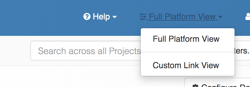
Select Custom Link View from drop-down list. This may have a different name depending on the title that you gave to your view.
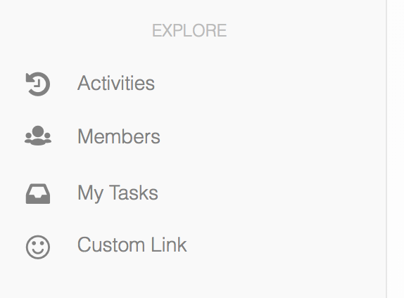
The screen should re-render and you'll now see your custom link on the left-hand side.
Click on the link and you'll be whisked away to a website for a company with a content management product that is beyond compare.
Once you've selected a View from the drop-down, the View will remain selected going forward. This provides a way for your users to effectively have multiple toolsets depending on the kind of task they're doing. Each View can provide a completely optimized toolset depending on the kind of work they need to get done.
Users are always free to switch over to a different View (or back to the default View) at any time.
Setting a Default View via My Preferences
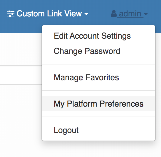
Your users can also manage their User Interface preferences by clicking on their name and selecting My Platform Preferences from the dropdown.
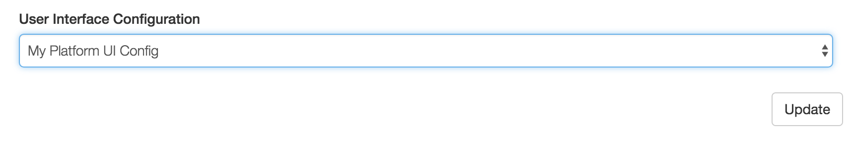
You will then see a drop down named User Interface Configuration. Here, a user can manually select which View they'd like to have as their default for the Platform.
They can also manage their Dashboard settings and their Menu settings (but this is covered elsewhere).
Adding a UI View to the Project
In the previous section, we looked at how you might add a new UI View to the Platform. In that section, we explored some of the concepts around the configuration service, configuration blocks and more. We recommend reading through that section to understand the basics of how things are done at the Platform level as they're quite similar at the Project level.
If you are a Manager of the Project, you have the ability to add Project-level UI configuration.
From within a project, go to Manage Project > UI Views. And then click on Create UI View.
This works very similarly to the Platform case. Give the UI View any title or optional description that you'd like and then create it. The UI View will be empty by default.
Add a Custom Link to the Left-Hand Project Nav
Suppose that we want to add a custom link to the left-hand project navigation menu.
We would like to have the following:
- A new link should added to the left-hand side
- The link should take us
https://gitana.io - The link should only render when folks are looking at the Project Dashboard
The project dashboard URI is /projects/{projectId}. As such, we can use a uri-match evaluator to make all this happen. Please check out the documentation on the uri-match evaluator.
The left-hand navigation menu retrieves its configuration from the project-context context. As such, the configuration key that we want to merge against is project-context. For more information on this context, check out the documentation on project-context.
You might add something like the following:
{
    "title": "Custom Link View #2",
    "config": {
        "blocks": [{
            "evaluator": "uri-match",
            "condition": "/projects/{projectId}",
            "config": {
                "project-context": {
                    "items": [{
                        "key": "project/customlink2",
                        "title": "Custom Link #2",
                        "uri": "https://gitana.io",
                        "iconClass": "fa fa-smile-o",
                        "allowPermission": [
                            "read"
                        ]
                    }]
                }
            }
        }]
    },
    "enabled": true
}
Click on Create to create your View. Once it's created, you should see it available in the header drop-down list when you're viewing the Project. The link will only appear on the left-hand side when you're viewing the Project Dashboard. It won't be visible when you click into other pages within the Project.
Setting a Default View via My Preferences
Your users can also manage their User Interface preferences by clicking on their name and selecting My Project Preferences from the dropdown.
You will then see a drop down named User Interface Configuration. Here, a user can manually select which View they'd like to have as their default for the Project.
Role-Based Provisioning
Use the allowAuthority and rejectAuthority arrays to show or hide items depending on what roles the current user has over the contextual scope.
Permission-Based Provisioning
Use the allowPermission and rejectPermission arrays to show or hide items depending on what roles the current user has over the contextual scope.
Team-Based Provisioning
Use the allowTeam and rejectTeam arrays to show or hide items depending on what roles the current user has over the contextual scope.